
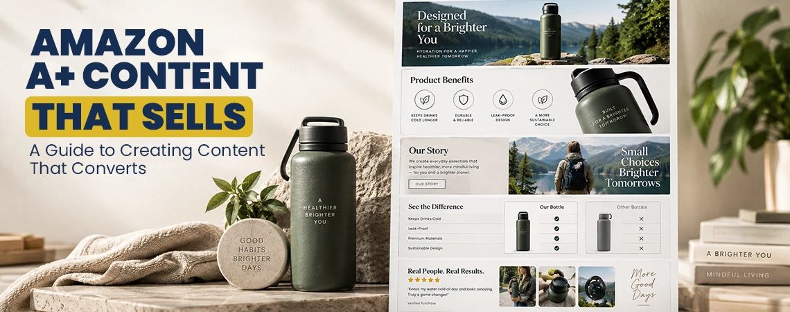
Amazon A+ Content Guide: How To Build Content That Converts
A+ Content creation isn't just about design. If an Amazon listing is getting a lot of visitors but shoppers are still unsure, the main issue is usually that the product page hasn't properly answered their questions. Weak A+ content can result in costly traffic that doesn't convert well, make a best-quality product seem average, and require sellers to spend extra on advertising just to achieve profits that the listing should have been generating. Great A+ content does a lot of important things. It explains the product properly, answers any questions or concerns, shows the benefits, builds trust, and provides shoppers with the information they need to feel satisfaction about their purchase decision.
 Why Most Amazon A+ Content Fails Before the Design Even Starts
For a seller who hasn't made any sales yet, having A+ Content won't suddenly solve problems like low traffic, pricing issues, bad reviews, product-market fit, or a weak main image. For a seller who already has thousands of visitors each month, not paying attention to the lower part of the product detail page can mean missing out on chances to increase sales.
At SpectrumBPO, our Amazon team sees A+ Content as an important part of the buying process, not just an appealing section at the bottom of the listing.
The way it works is straightforward:
- The title earns attention.
- The main images establish the first impression.
- The bullets explain the primary reasons to buy.
- A+ Content answers the questions that remain.
- Comparison content helps shoppers choose between products.
- Brand content gives buyers another reason to trust the seller.
- Testing tells the team which version actually performs better.
Amazon says that using Basic A+ Content may improve sales by as much as 8%. If you use Premium A+ Content properly, it could increase sales by nearly 20%. Those numbers are Amazon's internal standards, not a guarantee that every single ASIN will achieve the same outcome.
That difference is important.
A seller shouldn't pay for costly creative work just because a competitor has appealing A+ Content. The first question to ask is: What is stopping the shopper from buying this product?
That question decides what should be included in the modules.
What Amazon A+ Content Actually Does for a Product Page
Amazon A+ Content allows brand owners to present their products in more engaging ways. They can use images, text, comparison charts, videos, interactive features, and share their brand stories to provide more information about their products. The Basic and Premium formats offer different module choices, and the Brand Story has its own purpose in presenting the business and its products.
The common mistake we often notice is thinking that every module is essential.
It is not the case.
A kitchen appliance might need a visual demonstration to show how it works. An electronics brand may require showing details about compatibility, dimensions, ports, battery specifications, and a comparison of different models. A skincare product should include details about its ingredients, how to use it, where it fits in your routine, and responses to questions from customer reviews.
Using the exact same seven-module structure for all three products would be a careless approach.
The shopper is unique.
The objections vary.
The information needed to decide on a purchase varies.
At SpectrumBPO, our Amazon team starts by focusing on the product and the customer. We don't rush into the A+ Content Manager to pick templates right away.
The First Job of A+ Content Creation Is Finding the Buyer's Objections
A good-looking module won't solve the problem if the message isn't interesting to anyone.
Before we start writing or designing, our team checks for the questions that come up a lot in customer reviews, Q&A, competitor listings, search behavior, product details, returns, and feedback from the marketplace.
For instance, think about a portable projector that costs $79.
The seller might think that the biggest selling point is how bright it is.
The buyer might really be interested in:
- Whether it works with an iPhone
- Whether the fan is loud
- Whether the picture remains clear in a bedroom
- Whether the device is easy to set up
- Whether the remote feels cheap
- Whether it supports the streaming services they use
- Whether the projector is small enough for travel
If A+ Content keeps repeating "high brightness" in six modules, the seller has missed a chance to engage the audience.
A clearer structure could show how the product is used, explain how to set it up, demonstrate how it works with other devices, address any noise concerns, present its specifications, and compare this model with other products from the same brand.
Amazon suggests using technical specifications and comparison charts in order to help shoppers look at products and see how they differ from one another.
This is where the work of an Amazon content optimization agency stands out from just hiring someone to create visually appealing graphics.
The creative team has to understand the commercial background.
The copywriter needs to understand the customer's situation.
The Amazon manager is supposed to understand the marketplace better.
The person looking at performance needs to understand the sales background.
At SpectrumBPO, all these functions are part of the same client POD, which helps the A+ work link up with listing management, advertising, catalog tasks, and bigger marketplace choices.
Premium A+ Content Should Earn Its Space
Premium A+ Content allows brands to use more engaging formats like videos, interactive features, larger visuals, carousels, and better comparison tools. Amazon explains that these formats are designed to give shoppers more information and help them understand the products better.
But having more modules doesn't necessarily lead to increased sales.
This is considered one of the most costly mistakes an experienced seller can make.
A fancy layout with oversized pictures, decorative designs, common claims, and repeated messages might seem appealing in a presentation, but it doesn't really help the buyer much.
We like to find out exactly what each module is actually responsible for.
For instance:
| Module purpose | Question it should answer |
|---|---|
| Product demonstration | How does this work? |
| Feature explanation | What makes this different? |
| Lifestyle imagery | Where and how would I use it? |
| Technical details | Does it fit my requirements? |
| Comparison chart | Which product is right for me? |
| Brand Story | Who is behind this product? |
| Q&A | What could stop me from purchasing? |
A module that can't provide a helpful answer should be examined again.
Amazon suggests that you should balance text and photos, include technical specifications, create comparison charts, use Brand Story, and incorporate premium features like video, hotspots, carousels, and Q&A when they are suitable for the product.
How We Structure Amazon A+ Content Before a Designer Touches It
Our team often begins with a straightforward content map.
We like to find out five things:
- What brought the shopper to the listing?
- What does the shopper already understand?
- What does the shopper still not understand?
- What objection could prevent the purchase?
- What proof can the listing provide?
We only select which modules should have space after answering those questions.
This helps avoid a common issue where designers get a request like "create premium A+ content" but aren't given clear objectives for what the content should achieve.
A designer can create a stunning page.
An Amazon growth team needs to decide exactly what to put on that page.
The difference really matters for sellers who have launched a product but are struggling to make any sales.
A new seller might think that adding more graphics is the solution.
It might not be.
If a listing gets just 40 visitors each week, the first problem might be a lack of traffic.
If there are 4,000 visitors but only a few orders, it's clear that we need to focus more on improving the conversion rate.
If advertising is getting clicks but customers are leaving after looking at the product page, the team should take a closer look at the whole listing instead of simply putting more money into PPC ads.
This is how our team attaches A+ work with everything else in the account.
A+ Content can't save a product that no one is interested in.
It may help a shopper who already seems interested make a smarter choice.
Case Study: A Good Product That Looked Ordinary
We recently worked with a client who had some specific requirements. He wanted to create a reputable Amazon brand for a premium home organization product. However, his main ASIN was getting a lot of visitors, but it wasn't making the sales he hoped for.
The client had already put a lot of money into inventory, photography, PPC, and packaging.
The product got a lot of good reviews.
The issue was with the product page.
The listing described the product, but it didn't explain reason why the higher price was worth it.
The client's first request was simple: to create outstanding A+ content and make the listing appear more professional.
Our Amazon team had a different opinion about where to begin.
The problem wasn't that the listing appeared unappealing.
The problem was that the page expected shoppers to easily understand the product without providing enough background information.
Our team looked over what customer feedback said and found four common issues that kept coming up:
- Buyers were unsure how much the product could hold.
- Several shoppers misunderstood its dimensions.
- The listing did not show the product being used in a normal home environment.
- Competing products looked cheaper because shoppers could not immediately see the differences.
We rearranged the content to address those concerns.
The first visual highlighted how the product is used rather than showing the brand logo.
The next part showed what the product capacity was.
Another module showed dimensions using visuals instead of just written measurements.
We made a comparison section that showed the different models the client has and explained which scenarios each model was best for.
The Brand Story was set apart from the product details so that the company's history wouldn't interrupt a buying decision.
The text was made shorter.
Generic phrases were also filtered out.
We took out any claims that couldn't be backed up.
The creative team looked at the mobile layouts for the modules too, instead of just approving the design based on what they saw on desktop previews.
The project was split into four main phases.
Month 1: listing audit, customer objection research, competitor review, content architecture, copy development, and initial creative concepts.
Month 2: A+ implementation, listing refinements, PPC coordination, and performance baseline.
Month 3: performance review, content adjustments, advertising search-term analysis, and comparison-module refinement.
Month 4: testing of the strongest content variations and broader application of the approved content structure to related ASINs.
The ASIN had a conversion rate of about 8.7% when it entered the engagement.
After we made the first big changes to the content and updated the listings, the conversion rate increased to 10.4%.
In the fourth month, it got to 11.8%.
That showed about a 35.6% better conversion rate compared to the original 8.7% starting point.
The client didn't suddenly change their product.
Our team just made the product simpler for people to understand.
That difference is really important.
The outcome also impacted the financial aspects of the advertising account. With more visitors turning into customers, the client could assess how well their PPC is working based on a stronger product page instead of constantly trying to fix low conversions by spending more on ads.
The client asked us to use the same approach for three similar ASINs.
We created our own design instead of copying the original.
We used the same way of making decisions again.
Each ASIN got different modules depending on what customers wanted, its price, product features, and its role in the brand.
That's how our team handles amazon designs services, actually.
The output isn't just a compilation of pictures.
It's an important commercial aspect that is discussed on the product page.
Why A+ Content Cannot Be Separated From Amazon SEO
A+ Content and search optimization serve different purposes.
Your title, bullet points, backend search terms, category placement, product relevance, and other elements of your listing are really important. They help Amazon understand your product and show it to the right customers.
A+ Content is designed to help shoppers understand and assess the product once they arrive at the detail page.
That doesn't mean A+ isn't important for general Amazon performance.
A better conversion rate can really impact how traffic works financially.
Imagine two ASINs, each getting 10,000 visits from people who are really interested in them.
One changes at a rate of 5%.
The other one converts at eight percent.
With an average order value of $40, the first brings in $20,000 based on those visits, whereas the second option generates $32,000.
The traffic volume is similar.
The commercial result isn't.
That's why our team doesn't decide if the work is A+ just because a client says, "The graphics look good."
We ask if the page helps more qualified shoppers decide what to buy.
When you look at things like listing structure, search visibility, ads, creativity, pricing, reviews, and how well things convert together, A+ Content really shows its true importance instead of just being seen as a separate design task.
For sellers looking to increase their visibility, our Amazon SEO Services and Amazon SEO Management work is handled together with decisions about listings and catalogs, instead of viewing search visibility as an entirely different task.
The Difference Between Attractive A+ Content and Content That Sells
Appealing content states that:
"Check out our product."
Content that focuses on the buying decision says:
"First, let's look at the problem you're facing. Next, I'll explain how the product solves that issue. Then, I'll share what sets it apart from others. After that, I'll assist you with how to use it. Finally, I'll provide the important details you should know before making a purchase."
That difference seems minor.
It isn't.
A+ Content should help clear up any confusion.
If a shopper is unsure if the product will fit, provide the dimensions.
When they're curious about how it works, show them.
If they're curious about why it costs more, just explain the significant difference.
And when they are not sure which model to buy, compare the models.
If someone is unsure about the company's trustworthiness, provide them with reliable information about the brand.
If they're concerned about the setup, just simplify it for them.
If they are looking at different options, help them make the choice simpler.
Amazon offers A+ Content to give you more detailed product information. This includes better images, videos, comparison charts, customized text placements, and various other formats.
The seller, copywriter, designer, and Amazon team all have the job of figuring out what information should go in that space.
That's where the actual work starts.
How to Build Amazon A+ Content That Helps Shoppers Buy
The biggest mistake in creating A+ Content is beginning with the template rather than focusing on the customer.
A seller opens Amazon's Content Manager, looks at a number of modules, picks some appealing layouts, adds product photos, writes a few catchy feature statements, and thinks they're done.
That process can create appealing and interesting ideas.
It doesn't always create convincing communications about products.
At SpectrumBPO, our Amazon team begins with a simple question: What does the shopper need to understand before feeling comfortable placing the order?
That question decides what modules to choose, how long the text should be, what pictures to use, how to compare products, what technical details to include, and even the sequence of the modules.
Amazon offers two types of A+ formats: Basic and Premium. Each has its own creative features. Premium formats can have bigger visuals, videos, clickable spots, carousels, and other fun interactive features.
The seller doesn't need to use every feature that's common.
The seller needs to use what's suitable for the product.
Before we create premium A+ content, our team usually breaks down the buying decision into four phases, which are
Recognition:
The shopper understands what the product is.
Evaluation:
The shopper decides if it matches what they need.
Comparison:
The shopper looks at the product and checks out other options to see how they stand up against each other.
Confidence:
The shopper makes decisions about whether the product, price, brand, and what they expect from it make the purchase worth it.
A+ Content should help with the last three stages.
For instance, think about an excellent electric lunch box.
A mediocre A+ section could look like this:
"Portable design."
"Fast heating."
"Premium materials."
"Easy to use."
These statements might not be completely wrong.
They are just not finished.
A better presentation could show:
- The lunch box inside a work bag
- The size next to common objects
- The heating process
- How the cable connects
- How the food container is removed
- Cleaning instructions
- The difference between the available sizes
- Which buyer each version suits
The second presentation helps the shopper see why they should keep looking at the product.
That's the norm that our team follows.
Each module has a specific task to do.
The decision between Basic and Premium A+ should be based on what the product needs to say, rather than which option sounds fancier.
Basic A+ is great for products that have a simple buying decision.
A basic household item might require:
- A strong product explanation
- Feature-benefit sections
- Lifestyle photography
- Specifications
- Usage instructions
- A comparison chart
Premium A+ is even better when the product can show off its features through detailed demonstrations or a bigger visual story.
Some products that could really stand out with a more engaging presentation are:
- Electronics
- Fitness equipment
- Beauty devices
- Kitchen appliances
- Furniture
- Premium tools
- Complex consumer products
- Products with several variations
A premium module needs to prove why it's worth having, right down to the image sizes and templates in the Guide to Amazon A+ content too.
If a video just copies what the image already shows, it hasn't really added anything new.
If an interactive hotspot helps shoppers understand different product components without overloading the page with too much text, it might be worth the space it takes up.
If a comparison chart helps shoppers understand the differences between three similar models, it serves a clear business purpose.
We suggest looking at the information gap first and then considering the creative format.
The opening A+ section has a single purpose:
Why should I continue paying attention to this product?
Don't rush to explain everything all at once.
The first part should highlight the most important benefit that the product offers to customers.
Imagine a luxurious office chair that offers comfort and support for long hours of work.
Instead of:
"Feel great while you work with our luxurious ergonomic office chair."
A stronger visual idea could express:
"Made for long hours of work, with support that you can adjust to fit your body where you need it most."
So, the picture should back up what we're saying.
The text and picture should complement each other.
This is where a lot of sellers end up wasting important space.
They create a headline that states one thing but use an image that shows something completely different.
The shopper needs to understand two messages instead of just one.
We like to have one clear message for each module.
The headline states the claim.
The picture shows it evidently.
The supporting text provides more details.
That format helps people look through the page more easily.
One of the most frequent issues our Amazon copy team comes across is a long list of specifications.
A seller understands all the details about their product and thinks that the shopper wants to hear about everything in the same way they do.
The shopper doesn't.
A specification becomes convincing when its practical meaning is easy to understand.
For instance:
Specification: 20,000 mAh battery.
Average presentation:
"20,000 mAh high-capacity battery."
Stronger presentation:
"20,000 mAh capacity designed for extended use between charges."
The second statement provides some background information.
However, sellers should also be careful not to make promises they can't back up.
If a battery hasn't been tested for a certain number of hours on specific devices, don't make up a usage time just to make it sound better.
Our team reviews product documents before publishing any performance claims.
This is important for Amazon A+ content writing services because effective copywriting on Amazon goes beyond just being persuasive.
It should stay true to the real product.
The creative team must always be careful not to promise anything that the product can't actually provide.
Lifestyle imagery serves a purpose that goes beyond just looking nice.
It helps the shopper understand the situation better.
A coffee grinder shown against a simple background helps the shopper see what it looks like.
A coffee grinder sits next to a kitchen counter, surrounded by coffee beans, a mug, and a person getting their breakfast ready. This scene shows shoppers how it can be part of their everyday life.
The difference is really helpful for products that rely on size, convenience, appearance, or how they are used.
For instance:
A storage organizer should be displayed inside the kind of cabinet in which it will be used.
A camping product is supposed to be displayed when it's packed, being carried, assembled up, and used outdoors.
A beauty device should be displayed as part of a proper routine instead of just sitting alone against a plain background.
A product for kids should evidently show its size and how it's meant to be used, while also meeting the requirements for selling in the marketplace.
Our creative team puts forward a straightforward question:
If the shopper saw only the image for three seconds, would they understand why it belongs in their life?
If the answer is no, the image will need to be worked on again.
Looking for Amazon Premium A+ content examples can help sellers see what various brands are doing. However, simply copying a competitor's visual style is usually not the best approach.
The helpful part of looking at premium A+ content examples is figuring out how the best brands communicate their content:
- Product differentiation
- Use cases
- Product architecture
- Benefits
- Technical specifications
- Brand credibility
- Product comparisons
- Customer objections
A competitor might use dark backdrops, massive text, cinematic photography, and dramatic product representations.
Just because one thing is treated a certain way doesn't mean your product has to be treated the same way.
A skincare product that focuses on medical benefits might need a different look compared to gear for outdoor activities.
A good quality kitchen appliance might need some demonstrations to show how it works.
A fashion accessory might need some lifestyle photography.
A hardware product related to software might require diagrams and details about compatibility.
Before we pick the visual style, our team looks at the product category closely.
A+ needs to feel like a natural part of the brand.
Comparison charts are often not used enough.
Some sellers see them as a spot to show off every detail.
That makes things messy.
A more effective comparison chart provides answers:
Which product should I buy?
Picture a brand that offers three different air purifiers.
Model A is made specifically for bedrooms.
Model B is designed for bigger living areas.
Model C includes smart controls.
A helpful comparison chart might display:
| Buyer need | Model A | Model B | Model C |
|---|---|---|---|
| Small room | ✓ | ✓ | ✓ |
| Large room | ✓ | ✓ | |
| App control | ✓ | ||
| Compact size | ✓ | ||
| Best for bedrooms | ✓ |
The goal isn't to show that one product is better than all the others in every single way.
The goal is to assist the shopper in selecting the right product.
That can also lower the chances of a shopper picking the wrong option and later feeling unhappy because the product didn't fit their needs.
A properly designed comparison chart can benefit both the customer and the brand equally.
Video is really helpful when you need to show movement.
Think about a cordless vacuum.
A photograph can reveal its shape.
A brief video can show:
- How the attachment changes
- How the dust container opens
- How the product moves under furniture
- How the charging dock works
- How the controls operate
That's helpful information.
However, a video that shows a product spinning in front of a studio background for just fifteen seconds might not add much extra value.
Before asking for video production, our creative team has a few questions.
What can the customer understand from motion that a still image cannot explain as quickly?
If the answer is nothing at all, it might be better to use a different visual for the module.
Interactive hotspots are great for products that have many parts.
A technical backpack is a great example.
One hotspot might be able to recognize the laptop compartment.
Another one might describe the water-resistant material.
Another option might display the luggage sleeve.
Another might describe the quick-access pocket.
The error is including ten hotspots just because the platform permits it.
Having too many interactive factors can make shopping feel more difficult for the customer.
The strongest hotspots often highlight details that are hard to share in just one headline.
The shopper should easily grasp the benefit without having to search through the image.
A+ Content is way more helpful when sellers pay attention to the questions buyers are already asking.
Customer questions can show us what information we might be missing that our internal teams might not notice.
For instance:
"Is this the right size for a 15-inch laptop?"
"Can I wash this in a machine?"
"Can you use it with USB-C?"
"Does it come with a replacement filter?"
"Is this suitable for outdoor use?"
"Is the mounting hardware included in the package?"
These questions are important because they help the customer share exactly where they feel unsure with the seller.
Our Amazon team looks at what customers say, questions they ask, reviews they leave, returns they make, and any support problems when creating content suggestions.
If ten customers ask the exact same question, it's often better to put the answer somewhere easy to see instead of writing another long section about the brand's history.
The Brand Story serves a different purpose than the product-focused A+ modules.
Getting this right is part of what falls under broader Amazon brand consulting, not just the A+ module itself.
It allows the company to share who they are, what they create, and how their products connect with each other.
However, there's a typical mistake here as well.
Sellers often create a company biography that may seem significant to the founder but doesn't really connect with the shopper.
The customer often wants to find out:
- Why does this brand exist?
- What does the brand specialize in?
- What does it stand for?
- Why should I trust its products?
- Are there related products worth considering?
Make sure the story relates to why the customer is interested in the brand.
A founder's personal history may be helpful if it shows why the product was created.
It turns into a distraction when it takes up space without actually helping the shopper know about the product or the company.
A design that appears great on a big screen might be hard to read on a phone.
That's important because Amazon customers use various devices, and a big part of browsing in the marketplace happens on mobile devices.
Our creative approval method checks the following:
- Headline readability
- Text density
- Image clarity
- Product visibility
- Comparison chart legibility
- Module sequence
- Mobile cropping
- Contrast
- Visual hierarchy
A sentence that looks good on a computer screen might take up multiple lines on a mobile device.
Short text can be pretty unhelpful.
A complex comparison chart may be hard to understand.
A pleasing image might lose its most significant product detail if it's cropped too much.
A+ Content must be looked at in a manner where shoppers will really see it.
Sometimes, making things better means taking something away.
Our team often takes away:
- Repeated feature statements
- Empty promotional claims
- Unsupported superlatives
- Long paragraphs
- Decorative graphics with no purpose
- Repeated product photographs
- Generic brand statements
- Technical details that do not affect the buying decision
- Claims that cannot be verified
A seller might be hesitant to take down content at first because they invested money to create it.
That's called sunk-cost thinking.
The shopper isn't concerned about how much the seller spent in order to create a graphic.
They want to know if the information will help them make a decision.
If a module isn't working, just replace it with a new one.
A Second Spectrum BPO Client Experience: Turning Confusing Variations Into a Clear Buying Path
We recently worked with a client who had some specific needs. The client ran a consumer electronics brand and had six different Amazon ASINs for various versions of a similar product family. Our team took action to meet those requirements.
The products had impressive technical details and good reviews, but shoppers often chose one model even when another would have been a better fit for what they needed.
The client first believed the issue was with PPC.
Our Amazon team discovered another problem.
The product pages didn't properly explain the differences in the models.
The titles and bullet points had all the necessary details, but the comparison process felt a bit disorganized.
A shopper needed to look through different listings to find out which model had specific features.
The outcome led to some confusion that wasn't needed.
The client requested us to develop new A+ Content.
Our team at SpectrumBPO looked at the assignment like it was a product-family communication problem.
The first step was to conduct an audit of all six ASINs.
We kept a record of:
- Core features
- Product differences
- Price differences
- Intended use
- Customer objections
- Review themes
- Common questions
- Shared brand benefits
- Features unique to each model
The next step was creating a map of the product family.
Instead of showing six products as separate listings, we explained the purpose of each product.
The third achievement was about structuring the content.
The comparison module evolved into the main part for making decisions.
Every product was given a clear spot.
The fourth milestone was all about creative production and execution.
The design team made sure to keep the branding the same across all models, but they also added unique features to each one so that people wouldn't get confused.
The fifth turning point was all about looking at how well things are performing.
In the initial three months, our team observed conversion rates, sales for each ASIN, how effective the advertising was, customer questions, and buying patterns for different variations.
The client started with an average conversion rate of 6.9% for their entire range of products.
By the fifth month, the average had climbed to 9.6% after the content and listing changes were made.
That was about a 39.1% increase.
The most interesting improvement wasn't just the conversion rate.
The client mentioned that there have been fewer customer conversations about the basic differences between products.
The team took another look at the six-ASIN structure and suggested changes to how advertising money should be spent, depending on what each product does.
The client decided to continue working with SpectrumBPO since the work had progressed far beyond just creative production.
The team was assisting the brand in figuring out how customers were selecting their products.
That difference is important.
A+ Content has become a key part of the brand's merchandising system.
How SpectrumBPO Handles A+ Content as Part of the Wider Amazon Account
Our Amazon team isn't just a separate graphic-design department.
A standard client POD may consist of a Fractional Head of eCommerce, a Brand Manager, a PPC Manager, a Catalog Manager, designers, copywriters, and other specialists as needed.
The way we organize things is important because A+ Content can sometimes reveal issues that are beyond just the A+ section.
For instance:
A+ shows that two products are hard to tell apart.
The catalog team may take a look at the variation structure.
A+ shows that customers often want to know about compatibility.
The listing team can check out the bullet points and product specs.
A+ indicates that the price of the product requires a better explanation.
The brand team can take a look at the positioning.
A+ is not doing as well as expected, even though it has a lot of visitors.
The PPC and conversion teams can look at the entire journey of a purchase.
This is why clients often turn to our wider Amazon Agency Services when they face challenges that go beyond just creative production.
The team understands that not every sales issue is an A+ problem.
This is a major difference.
What Sellers Should Measure After Publishing A+ Content
Don't evaluate how well some content is performing just based on whether people say nice things about it.
Examine commercial behavior.
Some helpful metrics can be:
- Unit session percentage
- Ordered product sales
- Revenue
- Sessions
- Advertising efficiency
- Organic sales contribution
- Product-level conversion
- Return behavior
- Customer questions
- Review themes
- Performance across related ASINs
A+ Content should be checked against a sensible standard.
If the conversion rate was 7% prior to the change and 7.2% afterward, the team shouldn't celebrate too much. It's not a huge difference.
If the conversion rate increases from 7% to 9%, it's important to look into the reasons behind this change. What factors might have contributed to this improvement?
If revenue goes up while the number of visitors stays about the same, it can be a helpful sign.
If traffic goes down but conversion goes up, the team should look closely at both factors before deciding if the change was a good thing.
This is why SpectrumBPO shares A+ work by looking at the bigger picture of the account instead of just showing separate design numbers.
Common A+ Content Mistakes That Cost Sellers Sales
If the A+ section just repeats the exact same five bullet points with bigger images, shoppers don't get much new information.
"We care a lot about quality" doesn't really help someone decide to buy.
Display what quality means in the product.
Amazon customers browse.
Long paragraphs tend to hide the content you really care about.
Please avoid making up any performance numbers, certifications, guarantees, material properties, or product abilities.
Make sure to see how essential information looks on smaller screens.
A stunning scene doesn't help if the shopper can't figure out what the product does.
Having more modules can lead to more mess.
When people ask the same questions over and over, it shows that there are information gaps.
Look at how your competitors talk to their audience, but make sure to focus on your own product, your customers, how you position yourself in the market, and the proof that supports your claims.
A stunning product page won't generate interest for a product that doesn't meet people's needs.
It's important to look at traffic quality and conversion as a team. They go with one another.
What a Strong A+ Content Workflow Looks Like
We like to keep the process simple:
Check out the product page, images, bullet points, reviews, questions and answers, traffic data, conversion rates, pricing, competitors, and how the product is positioned in the market.
Identify the questions and doubts that are stopping shoppers from making a choice.
Determine the idea that each part needs to convey.
Write clear, short messages that focus on the customer and stay true to the product being sold.
Select pictures, diagrams, demonstrations, comparison charts, and other creative tools based on what information is needed.
Verify the claims, specifications, how the product is represented, and what the marketplace requirements are.
Create the A+ Content using either the Basic or Premium format as needed.
Examine how easy it is to read, how images are cropped, the order of information, and how well the information flows.
Make sure to write down the important performance data before you look at the changes.
Examine how conversion and sales relate to traffic and advertising.
Retain what is useful.
Change what remains the same.
Eliminate anything that causes confusion.
This process is especially helpful for sellers who have already started but are unsure why their product is getting visitors without enough orders.
The answer might not be "create A+."
The answer could be to figure out why shoppers are unsure, and then use A+ as a part of the solution.
That's a great place to begin with.
The Copy, Visuals, Proof, and Testing Behind High-Converting A+ Content
A+ Content might look fancy, but it can still miss the most important question: why should this shopper choose this product over another one?
That's where you can really see the difference between regular A+ content creation and serious work on Amazon content. The best pages don't crowd every space with visuals. They create a clear and convincing case for buying, starting from the shopper's first question all the way to the ultimate reason to make a purchase.
For SpectrumBPO's Amazon team, the copywriter, designer, catalog specialist, Brand Manager, and PPC specialist all work together, viewing A+ as part of a bigger creative project rather than just a separate task. They look at the product from different viewpoints and then figure out which details are important to focus on.
The outcome should be simple to grasp.
A shopper shouldn't have to spend a lot of time figuring out the page.
They are supposed to be able to look over it and quickly get the idea:
- What the product does
- Who it is for
- Why it is different
- How it works
- What problem it solves
- What they receive
- Which version they should choose
- Why the price makes sense
A+ copy loses its strength when each part starts with a marketing statement.
"Excellent quality."
"Outstanding performance."
"Developed for excellence."
"Designed for modern lifestyles."
These statements might sound fancy, but they don't really give the shopper much information.
A better way to start is by asking a question.
For instance:
Question: Can this storage container really fit under my bed?
Useful content: Show the height, width, and depth in a real bedroom setting.
Question: Can I clean this blender easily?
Useful content: Show the removable parts and how to clean them.
Question: Why is this coffee machine more expensive than another model?
Useful content: Explain the specific features, construction, included accessories, or performance differences that explain the price.
This is how our team handles Amazon content writing services.
We don't begin by asking, "What can we say about this product?
We question, "What does the shopper need to understand?"
Changing the way we think can lead to writing that is shorter and filled with helpful information.
A+ Content should feel unified and not just a bunch of random banners mixed together.
There needs to be a clear visual order.
The shopper should come across:
Main benefit → supporting feature → proof or demonstration → details → comparison → brand confidence
The specific order varies depending on the product.
Think about a premium water bottle.
The initial module might set up the primary use case.
The next one could show how well insulation works.
Another could show how the lid mechanism works.
A different one might clarify capacity and dimensions.
Another one could be to show cleaning.
The comparison portion could show different sizes side by side.
The Brand Story might then share a bit about the company.
This helps things move forward.
Every part provides an answer that the earlier part missed.
That's way better than just layering six random product photos on top of each other.
Our designers frequently get product photos that were originally made for the main listing.
Not every photograph is meant for A+.
A+ needs images that help achieve certain communication goals.
A close-up of stitching can be helpful for an excellent backpack if a brand wants to show how well it's made.
A close-up shot might not be necessary for a product where how it's made isn't an important reason to buy it.
The question being asked is always:
What does this image prove?
If the response is "nothing other than that the product exists," then the image might need to serve a different purpose.
This is especially important for premium A+ content examples that sellers really like to see online. The visuals can look really great, but the key message isn't about the colors or the photography style. The visual evidence helps the buyer make their decision.
Some products are easy to understand right away.
A phone case is pretty simple to show how it works.
Some products require additional background information.
Think about a pet feeder that works automatically.
A shopper might want to know:
- How food is loaded
- How portions are controlled
- How the schedule is set
- What happens when the container is empty
- How the unit is cleaned
- Where the product should be positioned
A set of demonstrations can get those points across quicker than a large number of paragraphs.
The same idea works for tools, appliances, fitness products, electronics, and items that have many moving parts.
When movement shows the benefits more properly than a still photo, using video is worth thinking about.
Amazon includes video as one of the features you can find in Premium A+ Content.
However, the quality of production should never be the main goal on its own.
The goal is to understand.
Category Changes the Way A+ Should Be Written
There isn't one copy structure that fits all Amazon categories perfectly.
Electronics
When buying electronics, buyers usually look for things like compatibility, specifications, how to set it up, controls, dimensions, what accessories come with it, and how different models compare to each other.
A strong A+ page needs to make it simple to find those details.
For instance, a wireless keyboard might need to clarify:
- Compatible operating systems
- Connection method
- Battery information
- Layout
- Device switching
- Included accessories
- Physical dimensions
Don't hide those important details under a lengthy brand story.
Beauty and Skincare
Beauty shoppers often think about things like ingredients, how to use the product, its texture, where it fits in their routine, how to apply it, any skin concerns they have, the packaging, and what makes the product different from others.
Pictures can show how things work and what they feel like.
Copy should be clear and true to facts, avoiding any claims about medical benefits or performance that aren't backed up by evidence.
Home and Kitchen
Exhibiting things can be more helpful here.
Show:
- Product size
- Storage
- Setup
- Cleaning
- Everyday use
- Capacity
- Included components
A kitchen product should appear like something that someone would really use in a kitchen.
Apparel
When choosing something, size, fit, fabric, construction, styling, care, and how you'll use it can be more important than just the technical details.
Lifestyle imagery is really helpful because it shows shoppers how things look in real life. It helps them understand the size, how things fit, and where they might use them.
Fitness Products
Demonstration can be really important.
Demonstrate how to put the product together and how to use it.
If the product includes several exercises or setups, make sure to arrange them properly instead of trying to fit everything into one packed visual.
A product can truly be better but still sell less if customers can't notice the difference.
This often occurs in busy categories.
Imagine there are five different products out there, and each one is saying it's the best. They all have their own claims:
"Durable."
"Portable."
"Easy to use."
"Premium materials."
The customer notices five messages that look quite alike.
The seller should explain the difference in a way that's easy to understand immediately.
Instead of using the phrase:
"Premium construction."
Display the building process.
Instead of using the phrase:
"Large capacity."
Display the capacity next to familiar objects.
Instead of using the phrase:
"Simple to set up."
Show how to set it up in three simple steps:
Instead of saying:
"Designed for travel."
Show the product in the real kind of bag that a traveler would use.
Evidence is more influential than just descriptive words.
Our Amazon team often advises clients to take out unclear compliments and exchange them for solid proof.
Specifications aren't boring if a customer needs them.
When they are given without context, they are dull.
For instance:
Weight: 4.2 lb.
That figure matters to a customer considering whether the product is portable.
Capacity: 32 oz
That's important for someone thinking about the product being big enough to fit into their life.
Dimensions: 12 × 8 × 4 inches
This is important for a buyer who does not have much storage space.
The writer needs to know why each specification is important.
Next, the designer may use the proper visual focus.
That's why Amazon A+ content agency work must be done by Amazon merchandising-skilled professionals, not just visual creation.
When every line seems like an advertisement, customers grow hesitant.
Take these two variants.
Version A:
"Our incredible premium bottle is expertly designed to provide perfect performance for every adventure."
Version B:
"Double-wall insulation keeps liquids hot or cold, and the leak-resistant lid is perfect for everyday carrying."
The second says more.
It also gives the customer something real to consider.
The copy team at SpectrumBPO usually prefers detailed facts over fancy words.
When the product has a quantitative attribute, describe it.
Show if the product has a specific use case.
If there's a good purpose for the brand to exist, let the customers know what it is.
Delete everything that is not supported by proof.
Reviews are not just about reputation indicators.
They can show how consumers actually use the product.
Positive feedback might highlight benefits to emphasize.
Negative reviews may be a sign of uncertainty.
Neutral ratings might sometimes indicate a lack of data.
Customers saying over and over:
"I wish I knew it was smaller than I believed."
That's a content issue.
Some of that may be handled by a dimension graphic.
If customers keep saying:
"I didn't know how to put it all together."
Maybe a setup sequence might assist.
If customers keep saying:
"Instructions were easy to follow."
That could mean that it's worth emphasizing the benefit of ease of setup.
The review language shouldn't be copied and pasted directly into the A+ space.
It needs to look for patterns.
Our team then uses that information to determine whether objections require a visual or written procedure.
Evidence may come from many different sources:
- Product specifications
- Manufacturer documentation
- Testing information
- Product photography
- Demonstrations
- Customer feedback
- Brand history
- Certifications where applicable
- Packaging contents
- Comparison data
- Warranty information where applicable
The more important a claim is, the more mindful we need to be about its verification.
This is essential for health, beauty, food, electronics, children's products, and other categories where wrong claims can lead to big issues.
A+ Content should help people understand the product better without exaggerating its qualities.
That's where trust is created.
A+ Content isn't the right point to put forward claims that might be hard to back up in other parts of the listing.
Our team looks over creative work for:
- Unsupported claims
- Misleading comparisons
- Inaccurate specifications
- Confusing product representation
- Prohibited or restricted language
- Inconsistent product information
- Incorrect packaging representation
- Claims that conflict with product documentation
This review takes place before the content is published.
Waiting for Amazon to reject content can cause unneeded delays.
A seller might have spent money on photography, design, writing, and adjustments, only to find out that one unsupported claim means they need to redo a whole section.
It's important to think about compliance as you write the copy.
Premium A+ is more effective when it can share information in a way that Basic A+ simply can't.
It can be helpful when:
- The product needs demonstration
- Several features need visual explanation
- The brand has multiple related products
- Product differentiation is difficult
- Interactive elements simplify technical information
- Video can explain usage
- The product has a premium price position
- Brand presentation contributes materially to purchase confidence
It might not be a good idea to spend more on production when:
- The product is extremely simple
- The buying decision takes only a few seconds
- There are few meaningful differences to explain
- The seller has very little qualified traffic
- The product itself has unresolved problems
- The listing has weak photography
- Reviews are poor because of product quality
- Pricing is considerably above comparable products without justification
This is the place where sellers can find honest advice.
A fancy design package won't make up for a poor product.
If a product gets bad reviews because customers are getting the wrong size, it's more important to fix that size problem than to make another expensive banner.
If customers are saying that the product malfunctions easily, it's more important to fix the product than to change the A+ layout.
Our team won't suggest more creative work just because the client has the budget for it.
A+ Content needs to be evaluated based on a standard measure.
Before you make any changes, be sure to write down important account details.
For instance:
| Measurement | Before | After |
|---|---|---|
| Sessions | 20,000 | 20,500 |
| Unit session percentage | 7.0% | 8.8% |
| Monthly orders | 1,400 | 1,804 |
| Average selling price | $32 | $32 |
| Revenue from measured traffic | $44,800 | $57,728 |
The numbers shown above are just an example and do not represent the results of any SpectrumBPO client.
The key thing to remember is how the metrics are connected to each other.
If the number of sessions stays about the same but more people are converting, it's possible that the content played a role in that change.
However, it's important not to assume that every improvement is due to A+.
Changes in pricing, growth in reviews, seasonal trends, availability of inventory, promotions, advertising shifts, competitors exiting the market, and other factors can all affect sales.
A focused Amazon team reviews the account activity around them before giving out credit.
It gets tricky to test when sellers make five changes all at once.
Imagine if the seller makes some changes:
- Main image
- Price
- PPC bids
- A+ Content
- Coupon
As a result, sales go up.
What change led to the improvement?
Nobody really knows.
That doesn't mean sellers can't make several changes when needed.
It means the team needs to know what was changed and when it happened.
At SpectrumBPO, we look at the entire timeline for performance reviews.
If A+ was released in the exact same week as a 20% price drop, the team won't say that A+ was the only reason for the rise in revenue.
Being honest in reporting helps build a strong connection with the client.
It also helps make decisions in the future easier.
A Third Way We Help Sellers: Fixing a Premium Product That Looked Too Expensive
Recently, a client in the home appliance category approached our team with a product that carries a price point higher than several prominent competitors.
The client felt that the increased price signified superior materials and more solid construction.
The issue was that shoppers were unable to recognize those differences.
The listing showcased impressive photography, yet many of the images emphasized looks over the actual construction details.
The client asked for premium A+ content, noting that competitors showcased visually more progressive product pages.
Our team began by looking into customer feedback and examining how our competitors are positioned.
The problem became evident.
The product wasn't exactly overpriced.
The value just didn't resonate enough.
We developed a content plan centered on evidence.
The initial milestone centered around building the product.
The subsequent one emphasized the material benefits of the construction.
The third showed application.
The fourth focused on showcasing the client's models instead of criticizing competing brands.
The fifth section covered care and maintenance.
The sixth improved the brand portion.
The creative team decided to simplify the original concept by removing several decorative parts that were overshadowing the product itself.
Prior to the work, the ASIN had an average conversion rate of around 5.8%.
After three months, we saw conversion reach 7.4%.
By the sixth month, it rose to 8.1%.
That reflected about a 39.7% increase compared to the initial conversion rate.
The revenue saw growth during this period, yet the team was careful not to credit the entire increase solely to A+. They recognized that factors like PPC, review volume, pricing, and traffic also changed during this time.
That's how we share the results of our client's performance.
We reveal what has changed.
We share what our team worked on exactly.
We disclose the timing.
We distinguish between correlation and certainty.
The client chose to continue with SpectrumBPO after the initial evaluation because the account team showed the price was justifiable when the product's value was evidently communicated.
What SpectrumBPO Looks For Before Recommending A+ Work
Before production starts, our team has a few questions to ask:
Does the ASIN have enough qualified traffic to evaluate conversion?
If that's not the case, you might want to focus on improving search visibility and the quality of your traffic first.
Are the reviews strong enough?
If customers keep saying there are problems with the product, then focusing on content isn't the most important thing.
Is the product differentiated?
If all competitors provide the same features but at a lower price, being creative alone won't fix the issue.
Is the listing accurate?
A+ can't make up for wrong titles, bullets, images, or specifications. Sellers in this position usually need an Amazon listing audit before spending on creative production.
Are customers confused?
If that's the case, A+ could play an important role.
Does the product require demonstration?
If that's the situation, a more elaborate creative approach might make sense.
Are multiple ASINs competing for the same customer?
If that's true, comparison content can be really helpful.
Does the brand have enough products to tell a useful story?
If that's correct, the Brand Story and cross-product presentation might need a bit more focus.
This evaluation helps clients avoid wasting money just because there's an A+ package offered.
What Makes SpectrumBPO's Approach Different
SpectrumBPO has a team of over 400 people working right here to help eCommerce brands on Amazon and other big marketplaces.
Regarding Amazon accounts, depth is important because the A+ project usually doesn't stand alone.
A listing problem can relate to how a catalog is organized.
A conversion issue may be connected to advertising.
A product-positioning problem can relate to pricing.
A variation problem can relate to how confused customers might feel.
A brand problem may be linked to not enough differentiation.
Our POD structure lets the right specialists look at those issues instead of having one general account manager do everything.
This helps to establish a more transparent chain of responsibility for our client.
The Brand Manager is in charge of coordinating the account.
The Amazon experts look at how well the marketplace is doing.
The copy team creates the messages.
The design team puts together the visual presentation.
The Amazon PPC consultant looks at how good the traffic is and how people behave with the ads.
The Catalog Manager looks at product details and how the marketplace is organized.
The leadership checks if the work is helping the client reach their bigger business goals.
That's how we focus on the best Amazon content services.
The service shouldn't be evaluated based on the number of banners that were sent out to customers.
The content should be evaluated based on how well it helped the product show its value with greater clarity.
The A+ Content Decision Sellers Should Make Before Spending Money
Before giving production approval, ask one question:
What problem is this content supposed to solve?
If the answer is:
"We need the listing to look more professional,"
keep on asking.
Why is that?
Because "professional" isn't something we can measure as a business problem.
If the response is:
"Customers are confused about the difference between our two models," now the team has a challenge to address.
If the answer is:
"Traffic is strong, but shoppers leave because they don't see the product's value," that's another helpful starting point.
If the answer is:
"Customers often want to know if the product works with a specific device," which shows there's a great chance to create helpful content.
If the answer is:
"The high price we have isn't explained well on the product page," the creative direction becomes much simpler.
A+ Content is most effective when it addresses a genuine issue.
That's why our team takes the time to understand the ASIN before we start working on the design file.
How SpectrumBPO Works With a New Client
We understand that not every seller is ready to sign an extended agency contract before they get a feel for how a team operates.
SpectrumBPO does not require any upfront payment for the service model explained to potential clients. Clients have the chance to try out the services for a month before deciding if they want to keep using them.
The first month is a great time to set up the account's starting point, find the biggest content issues, focus on the ASINs that need the most help, and start working toward the client's goals.
The goal isn't to guarantee a specific number of sales.
No Amazon team can promise a specific revenue outcome because sellers face constantly changing factors like competition, pricing, inventory, reviews, advertising, category conditions, and marketplace rules.
This honesty is something sellers should expect from any Amazon consultant services relationship, not just from an A+ engagement.
The goal is to demonstrate to the client the way the team operates.
The client must be allowed to see:
- What was reviewed
- What problems were found
- What was changed
- Why the change was made
- What happened afterward
- What should happen next
SpectrumBPO builds trust with Amazon sellers through that transparency.
A+ Content is just one piece of that connection.
The main goal is to help the client figure out why their Amazon account is acting in the manner that it is and what the team can actually do to help fix it.
The Practical A+ Content Blueprint, Review Process, and Seller Decision Guide
A+ Content should help shoppers have fewer questions when they visit the product page. It should provide clear information that makes things easier to understand.
That might seem easy, but a lot of sellers focus on how their A+ Content looks rather than how well it helps buyers understand the product. A page might have fancy photos, exclusive graphics, Premium modules, comparison charts, and videos, but it can still miss an opportunity by not properly showing why the product is worth the shopper's money.
At SpectrumBPO, our Amazon team follows a unique approach.
Before we give the go-ahead to an A+ Content project, we want to know:
- What problem is the shopper trying to solve?
- What information is missing from the existing listing?
- What objections appear in reviews and customer questions?
- What makes this product different?
- Which claims can the brand prove?
- What should the shopper understand after viewing each section?
- What should the shopper do with that information?
The answers define what we talk about.
Amazon offers A+ Content to brands that qualify, allowing them to include more detailed product information. This can be done through better images, text, comparison charts, videos, Brand Stories, and other types of content. Amazon shares that A+ Content might help increase sales according to their internal data. However, it's important to remember that these numbers aren't promises for any specific ASIN.
That difference should always be at the core of every seller's choice.
A+ isn't something magical.
It's all about communication.
The more the communication answers the shopper's questions, the more helpful the product page is.
The Complete A+ Content Blueprint
A seller doesn't have to replicate a competitor's design.
Instead, create the page following a clear and logical order.
The beginning section should respond to:
Why should I care about this product?
Focus on one main advantage.
Avoid putting six claims into a single headline.
Take a look at a premium mattress topper, for instance:
Weak:
"Premium comfort, excellent quality, great support, airy design, and a luxurious touch."
Stronger:
"Add a softer sleep surface without replacing your existing mattress."
The second statement provides the shopper with a clear reason to keep going.
The image should support that idea.
After the shopper knows the main benefit, describe how the product creates that benefit.
Use:
- Product close-ups
- Diagrams
- Demonstrations
- Feature callouts
- Short supporting copy
A product feature needs to have a purpose for being present.
If the product has three layers, explain what each layer does.
If the product features a unique locking mechanism, please show how it works.
When a component makes things easier, demonstrate how it's used.
This part needs to provide an answer to the question:
What will this look like when I actually use it?
Context is especially helpful for:
- Home products
- Kitchen products
- Apparel
- Outdoor products
- Fitness products
- Beauty products
- Electronics
- Pet products
Scale is important.
A product shown by itself can be hard to evaluate.
When you see a product next to a person, a piece of furniture, or something else you recognize, it makes it much easier to understand.
Don't run away from tough questions.
Respond to them.
If customers have questions about:
- Size
- Compatibility
- Installation
- Cleaning
- Durability
- Charging
- Storage
- Weight
- Included accessories
- Maintenance
- Usage limitations
Make sure to give those questions enough space.
This represents one of the areas in which SpectrumBPO's Amazon team puts a lot of effort into reviewing customer feedback.
The customer usually lets you know what information they need.
A+ Copy Should Be Shorter Than Most Sellers Think
A+ Content shouldn't be used to copy the whole product description.
A shopper must be able to quickly look through the page.
Use:
Headline
One straightforward idea.
Supporting statement
The benefit is explained in one or two phrases.
Visual
Proof of the claim.
Detail
Just the essential details needed to understand or assess the feature.
That format is simpler to understand than a large section of text.
A seller could describe a product's construction in about 150 words.
The designer might simplify that to three brief statements next to a cross-sectional image.
The second version may communicate faster.
That's why A+ content should be designed as visual communication instead of just being written and pasted into fancy boxes.
A+ Content Creation Should Start With a Content Map
Before production, the SpectrumBPO team can put together a straightforward content map.
| Shopper question | Content response | Recommended presentation |
|---|---|---|
| What is the product? | Core benefit | Opening visual |
| Why is it different? | Differentiating feature | Feature module |
| How does it work? | Demonstration | Video or visual sequence |
| Will it fit my needs? | Size/specification | Diagram |
| Which version should I buy? | Product differences | Comparison chart |
| How do I use it? | Instructions | Step sequence |
| Why trust this brand? | Brand information | Brand Story |
| What concerns do buyers have? | Answers | FAQ or supporting section |
This keeps the design process focused and organized.
Each module serves a purpose.
Each and every visual has a purpose.
Every piece of writing helps make a choice.
The Product Comparison Module Deserves More Attention
Comparison charts can affect how shoppers filter through a range of products.
Imagine a brand that offers:
- Standard model
- Pro model
- Family model
The shopper might be unsure about which one is the right choice.
A helpful comparison chart can display:
| Feature | Standard | Pro | Family |
|---|---|---|---|
| Compact size | ✓ | ✓ | |
| Extended capacity | ✓ | ✓ | |
| Advanced control | ✓ | ✓ | |
| Designed for larger households | ✓ |
The comparison needs to be precise.
Don't make a chart that shows one product as better than all the others in every single category.
This may make the page seem more like an advertisement instead of being useful.
The goal is to make things clearer.
If the shopper picks the right product, considering the differences is easier to see, then the comparison has succeeded.
Use Brand Story Without Turning It Into a Founder Biography
A brand story can help build trust, but it's important that the brand section stays relevant to the shopper.
A helpful story could describe:
- Why the company created the product
- What problem the company focuses on
- What the brand specializes in
- How the products relate to each other
- What customers can expect from the brand
A weak story takes a long time to talk about the founder's childhood, their journey in business, and their dreams, but it doesn't really link these details to the product itself.
Ask:
Why would a shopper care about this information before buying?
If the answer is not clear, make it shorter.
Build A+ Around Product Positioning
A+ Content should highlight the product's position in the market.
A $15 product or a $150 product shouldn't always be communicated in the same way.
For a premium product, shoppers often look for more proof that explains:
- Construction
- Materials
- Performance
- Craftsmanship
- Included components
- Warranty
- Product development
- Long-term usability
For a product that emphasizes value, the page should evidently convey:
- Practical benefits
- Ease of use
- Included features
- Capacity
- Convenience
- Price-related value
This doesn't mean that every costly product requires fancy pictures.
It means that the way we talk about the product should fit its place in the market.
The Best Amazon Content Services Should Include More Than Copy and Design
Sellers looking for the best Amazon content services usually compare agencies by looking at their portfolio images.
That makes sense.
However, portfolio quality reveals just a portion of the complete picture.
Ask the agency:
- Who researches the customer objections?
- Who reviews the listing?
- Who checks product information?
- Who writes the copy?
- Who designs the creative?
- Who checks marketplace requirements?
- Who reviews performance after publishing?
- Who communicates with the PPC team?
- Who decides what should be changed?
- Who owns the process?
If the answer to every question is a single freelancer or only one account manager, the seller needs to recognize the limitations of that setup.
A+ Content usually involves different sections of an Amazon account.
The more complicated a product is, the more helpful it is to have people from different areas working together.
A Practical Review System for A+ Content
Our team may examine the page using five filters prior to approving the ultimate creative.
Are all the statements consistent with the actual product?
Check:
- Dimensions
- Materials
- Compatibility
- Included components
- Product specifications
- Product variations
- Usage instructions
Even if an error is beautiful, it is still considered an error.
Can a buyer readily comprehend the message?
Remove:
- Long sentences
- Repeated claims
- Technical language without explanation
- Unnecessary adjectives
- Decorative statements
Is the stated claim supported by the visuals?
Show scale if the product is described as compact in the copy.
Show the installation procedure if it states that it is easy.
Show the product's various compartments if it has multiple compartments.
Can the shopper understand why this product is different?
The positioning needs to be improved if the page might belong to any competitors in the category.
Does the page address the questions that could prevent an order?
If not, review what customers have said.
The A+ Content Review Questions We Give Amazon Sellers
Prior to publication, ask:
Can I explain the product in a single sentence?
If not, the information might be unclear.
Can I figure out who the primary buyer is?
If not, the message can be very general.
Could I describe the main reason for someone's hesitation?
If not, an objection could be ignored by the page.
Can I provide visual evidence for the key product claims?
If not, there could be an excessive amount of promotional copy in the content.
Can I distinguish this product from the closest substitutes?
If not, there might be little incentive for the customer to select it.
Can I comprehend the differences between variations?
If not, it could be important to provide a comparative section.
Can I easily locate the crucial specifications?
If not, there can be needless friction on the page.
Without sound, does the page continue to make sense?
When using video, this is important.
On smaller displays, is the content still readable?
If not, another assessment of the creative is required.
What Sellers With Zero Sales Should Fix First
Since many new sellers believe that their initial investment should be in A+ content, this needs extra attention.
Frequently, it isn't.
This is useful context for sellers looking to start an Amazon store and deciding where to focus first.
The seller must figure out why an ASIN receives so little attention.
Check:
- Search visibility
- Keyword relevance
- Listing quality
- Product category
- Pricing
- Reviews
- Main image
- Product demand
- Inventory
- Advertising
- Competitive positioning
Conversion should be looked into if the listing receives 100 relevant visitors but generates no sales.
The sample size is insufficient to draw solid conclusions about conversion if the listing has ten visitors.
A new seller may avoid spending thousands of dollars on creative without addressing traffic due to this distinction.
A+ content is helpful.
It cannot be used in place of product-market fit.
What Established Sellers Should Fix First
Established sellers face a distinct issue.
They frequently have several products, historical data, traffic, and reviews.
The question is:
Where is the account losing potential revenue?
Examine these for an established ASIN:
- Traffic quality
- Conversion
- Competitor changes
- Product reviews
- Pricing
- Advertising
- Product positioning
- Variation structure
- Listing content
- A+ Content
- Brand Store experience
- Inventory consistency
If a product is getting a lot of visitors but not many are making a purchase, it might be time to take a closer look at A+ content.
If competitors have come out with better products at lower prices, just changing A+ won't fix the issue.
If a product has great reviews but shoppers are confused about the differences between models, creating clear content could be a great opportunity to help them out.
The diagnosis happens before production.
A+ Content and Advertising Need to Tell the Same Story
Suppose an advertisement says:
"Quiet cordless vacuum cleaner for apartments."
You are then taken to the product page with
"Modern cleaning technology for all environments."
The shopper got two different messages.
The A+ Content needs to back up the promise that got people interested in clicking.
If advertising highlights portability, the page should show how portable it is.
If the ads focus on battery life, the page needs to provide details about the battery.
If advertising focuses on a specific use, the product page should clearly explain that use case.
SpectrumBPO's POD structure lets the PPC Manager and creative team talk about these connections.
That's important because advertising can shape what we expect.
A+ should help meet those needs.
A+ Content and Reviews Should Reinforce Each Other
Imagine customers constantly giving compliments:
"Simple to set up."
"It's really quiet."
"It fits just right under my desk."
Those themes might need more attention.
Make sure not to show customer comments as evidence unless they truly reflect what most people think and you have permission to use them for that purpose.
Instead, focus on the main advantage.
For instance:
Easy setup
Display the setup.
Quiet operation
Describe the important details about the product or any proof that supports its claims.
Compact fit
Display the measurements in a way that relates to the context.
The review gives you a hint.
The A+ Content gives a clear explanation.
How SpectrumBPO Handles Performance Reviews
Our team makes sure to provide clients with reports that include clear explanations, not simply a list of numbers.
The important question is:
What changed, why did it change, and what should we do next?
A monthly review might look at:
- Sessions
- Conversion
- Orders
- Revenue
- Advertising
- Search terms
- Product reviews
- Content changes
- Inventory
- Competitor activity
For A+ Content, we look at when we make changes to the content and how that lines up with the complete account activity.
This helps prevent making exaggerated claims.
If A+ was modified and the conversion got better, that's definitely something to look into.
If A+ changed while traffic doubled, prices dropped, and a coupon was introduced, the team needs to consider those factors.
Clients deserve truthful reporting.
Another SpectrumBPO Case Study: A New Brand With Traffic but Almost No Orders
We recently worked with a client who had these requirements. She launched a new personal-care product on Amazon and put resources into inventory, packaging, photography, and initial advertising. Our team stepped in to help her achieve her goals.
The product was attracting attention.
Orders fell short of expectations.
She initially asked for premium A+ Content, feeling that the listing appeared less professional compared to established competitors.
We took a close look at the account before suggesting production.
The ASIN experienced around 4,800 monthly sessions, yet the conversion rate stood at just 2.9%.
There was sufficient traffic to justify a more thorough examination of the conversions.
The team found a few issues.
The main image conveyed the product properly, yet it fell short in illustrating its primary use case.
The bullet points emphasized the ingredients and specifications considerably.
Customer queries expressed confusion regarding how the product integrated into their daily routines.
The A+ section was either missing or not fully worked out.
Competitors showcased their applications through visual demonstrations.
The team broke the project down into five key milestones.
The initial month centered around understanding customer queries, reviews, competitor positioning, product information, traffic sources, and listing structure.
The team identified that A+ contributed to the issue, but it wasn't the whole issue.
Our copy team reshaped the product communication to align with the customer's daily life.
Rather than just listing ingredients, the content focused on the product's purpose, usage, its place in a routine, and what set the formula apart.
The design team created visual demonstrations, highlighted key ingredients, provided usage instructions, and simplified the sequence of product benefits.
The Amazon team ensured that the A+ messaging matched the main listing, providing shoppers with an effortless flow of consistent information from the first image to the lower sections.
The team took a close look at conversion rates, traffic, advertising, customer inquiries, and reviews in the months that followed.
The ASIN began with a conversion rate of approximately 2.9%.
By the third month, it hit 4.1%.
In the sixth month, it stood at 5.2%.
That marked about a 79.3% increase from the original conversion rate.
The improvement can't be solely attributed to A+, as there were additional listing and advertising changes happening at the same time.
The client valued that difference.
She initially anticipated a design project.
Our team instead identified the reasons behind the product's visibility without translating that into sales.
Six months later, the client chose to continue our partnership and broaden the scope to include more ASINs.
This project is one of several ecommerce case study examples our team has documented internally.
That's the kind of connection we strive for.
A client deserves more than just files.
The client must be aware of the reasons behind the work, along with what the performance data reveals afterward.
When a Seller Should Not Hire an A+ Content Team
There are times we'd like a seller to put a hold on producing.
Don't focus on A+ if:
- The product has serious quality problems.
- Reviews reveal recurring defects.
- Inventory is unreliable.
- The product has almost no qualified traffic.
- The price is far above competitors without a clear reason.
- The product category is poorly selected.
- The listing has inaccurate product information.
- The brand has not established what makes the product different.
- The seller is still changing the product itself.
First, fix the foundation.
Then, spend on communication.
This method may not be as exciting as jumping right into Premium creative, but it does secure the seller's budget.
How Much A+ Content Is Enough?
There isn't a specific number of modules that can ensure improved performance for everyone.
The right amount varies based on the product.
A straightforward product might only require a handful of solid sections.
A complicated product might need more.
The aim isn't to make it as long as possible.
The aim is to have enough information.
A shopper should complete the A+ section with a clear understanding of the product, without feeling like they've just gone through a sales pitch.
If six modules cover all the important questions, there's no need to add three more just to fill up space.
Having empty space is preferable to including content that doesn't matter.
What a Strong A+ Content Creation Brief Should Include
Before a designer starts, it's important to provide:
- Product name
- ASIN
- Category
- Variations
- Specifications
- Package contents
- Primary buyer
- Main use cases
- Common questions
- Common objections
- Review themes
- Main competitors
- Price range
- Product differences
- Common competitor claims
- Brand positioning
- Visual identity
- Brand story
- Related products
- Sessions
- Conversion
- Revenue
- Advertising activity
- Review count and rating
- Existing photography
- Video assets
- Brand guidelines
- Preferred visual direction
- Required product demonstrations
This helps the creative team understand the context.
Without it, the designer has to make guesses.
The SpectrumBPO A+ Content Standard
Our Amazon team has a straightforward internal test:
Would this section help a serious shopper make a decision?
If yes, keep it.
If it just makes the page look nicer, you should think twice about it.
If it repeats a section, take it out.
If it makes a claim that can't be backed up, change it.
If it causes confusion, make it simpler.
If it addresses a common question from customers, make sure it gets the attention it deserves.
This standard applies no matter whether the seller needs Basic A+ or Premium A+.
The format is changing.
The principle does not.
Choosing Between Basic A+ and Premium A+
Basic A+ should be used when:
- The product is simple.
- The buying decision is straightforward.
- A few strong visuals can explain the product.
- The budget needs to remain controlled.
- The product does not need video or interactive presentation.
Premium A+ should be preferred when:
- Product demonstration matters.
- Several features require visual explanation.
- Product differences are difficult to communicate.
- The brand has multiple related products.
- The price position requires stronger presentation.
- Video or interactive features can materially improve understanding.
- The product benefits from richer storytelling.
Don't pick Premium just because competitors have it.
Select it because the product offers something valuable to share through its extra features.
The Questions Amazon Sellers Usually Ask Us
It surely can.
Amazon has found that using A+ Content could lead to better sales, according to their own tests and comparisons. However, the results can differ depending on factors like the ASIN, category, quality of traffic, reviews, pricing, product quality, and how well everything is put together.
The main goal isn't to take the place of the search features found in an Amazon listing.
Sellers should keep improving their titles, bullet points, search terms, category relevance, product details, and other aspects that help Amazon understand their products better.
A+ focuses on improving how products are communicated and considered for purchase.
No. Premium A+ offers additional creative options.
Having more abilities doesn't always mean that communication will improve.
If the listing is already getting good traffic but not converting well, trying out A+ content could be a good idea.
If the ASIN isn't getting much traffic, start by looking into the traffic and demand for that product first.
No. A+ may describe a product more properly, but it can't fix a problem with the product's quality.
There isn't a standard schedule.
Change it when there's a good reason:
- Product changes
- Positioning changes
- Customer objections change
- New products are introduced
- Brand presentation changes
- Performance indicates a content problem
- Marketplace requirements change
Don't change the content just to make it more active.
Products that are related can have similar brand features and ways of communicating.
They don't have to have the same content.
Every ASIN needs to focus on its specific buyer, highlight its features, tackle any objections, and clarify its position in the market.
A Practical Pre-Publishing Checklist
Before you submit your A+ Content, make sure to check each item:
- The main product benefit is immediately understandable.
- Each module has a specific communication purpose.
- The copy is concise.
- Product claims are accurate.
- Specifications match the product information.
- Images accurately represent the product.
- Product scale is understandable.
- Important customer questions are answered.
- Product differences are clear.
- Comparison information is accurate.
- The brand story is relevant.
- Video adds information that static images cannot communicate as well.
- Interactive features have a clear purpose.
- The page is easy to scan.
- Text remains readable on smaller screens.
- The content does not simply repeat the bullets.
- Unsupported claims have been removed.
- The content matches the product's actual market position.
- The team has recorded the relevant performance baseline.
- The client understands what was changed and why.
What Sellers Should Expect From an Amazon Content Partner
A seller who hires an agency shouldn't just get a number of nice designs and be left waiting for sales to happen.
The agency needs to be prepared to explain:
What was wrong?
What did we change?
Why did we change it?
What evidence supported the change?
What happened afterward?
What remains unresolved?
SpectrumBPO builds strong connections with its clients in this way.
The team focuses on solving real business problems instead of just finishing design tasks.
A client might start using A+ Content and realize that the bigger problem is how well their listing converts.
Another person might start with conversion and find that their search visibility is holding back their traffic.
Some products might need to be grouped together because shoppers have a hard time telling the differences between them.
The work should be in accordance with the problem.
SpectrumBPO's One-Month Test Model
Sellers are naturally careful about choosing an agency until they can see how the team works.
SpectrumBPO doesn't ask for any payment upfront with the service model we offer to potential clients.
A seller can try out the services for a month and then decide if it makes sense to keep going.
The first month should help everyone understand things better.
The client should see:
- Account findings
- Priority problems
- Content recommendations
- Work completed
- Communication from the assigned team
- Reporting
- Performance movement where enough data exists
- Recommended next steps
It's important to understand that one month isn't enough time to change the whole history of an Amazon account.
In just a month, you can really get a sense of how the team thinks, communicates, gets things done, shares reports, and handles challenges.
Long-term performance improvements rely on several factors, including the product itself, its category, the amount of traffic it gets, the level of competition, inventory, customer reviews, advertising, and the general work needed.
Why A+ Content Should Be Treated as Part of Merchandising
The best Amazon pages make it easy for shoppers to understand why a product is important without any confusion.
They share the information in a way that follows the steps people take when making a purchase.
In other words:
The main image grabs your attention.
The listing shows why it's important.
The bullet points highlight the main benefits.
A+ provides thoughtful answers to more complex questions.
Comparison content is useful for choosing products.
Brand content builds trust.
Advertising attracts the right buyers to the page.
Reviews give social evidence.
The product really delivers on what it promises.
A+ Content is part of that process.
It can't hold the whole account.
It shouldn't be expected to.
When a product truly has value, but shoppers aren't getting it, A+ can be a great way to help improve communication.
The Final Decision: What Should You Do With Your ASIN?
If you have zero sales, don't jump to the conclusion that A+ is the issue immediately.
First, check the demand, traffic, pricing, product quality, reviews, listing accuracy, search visibility, and advertising.
If you have traffic but weak conversion, it's time to take a closer look at A+. This is especially important if shoppers seem confused about the product, what it offers, how it stands out, or how to use it.
If you have strong conversion but limited traffic, focusing on A+ might not be your top concern. Search visibility, advertising, product positioning, and marketplace reach are important topics that should be given more attention.
If you have multiple related ASINs, creating comparison content can help shoppers figure out which product is the best fit for them.
If you have a premium-priced product, use A+ content to show why it's worth that price instead of just saying it's premium.
If you have frequent customer questions, think about turning those questions into content ideas.
If you have strong reviews, take a look at the benefits that customers often talk about. See if those benefits should be highlighted more prominently.
If your A+ Content looks great but sales are still low, it's time to stop wondering about its appearance.
Check if it addresses the buyer's questions.
Our Amazon team at SpectrumBPO uses that standard.
The goal isn't to just fill up the page.
The goal is to make the product simpler to understand, easier to compare, and more trustworthy.
When the product is great, the traffic is relevant, the listing is correct, and the content properly shows its value, A+ Content is much more likely to help improve conversions.
When the numbers don't get better, we shouldn't just put up another fancy banner.
It needs to be a more accurate diagnosis.
Share this Post




Blog Categories
Uncategorized
